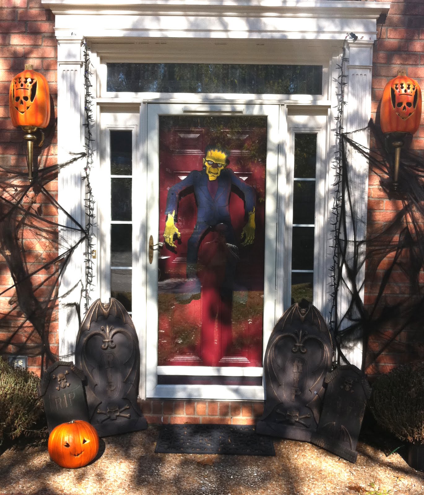
This year I wanted some fun Halloween decorations for the Conrad domicile, but after doing some scouting out at the stores, all I could find were generally either the more "gory" representations of all that monsters and Halloween have to offer or stuff that was perhaps a little too "kiddie" in tone. Not that there's anything wrong with either....
But not exactly what I had in mind...I was looking for stuff more in the spirit of the classic Universal Monsters, The Mad Monster Party, The Munsters, Disney's Haunted Mansion etc.. Also for the actual decorations, what I was looking for was something along the lines of the old halloween mainstays; The cardstock witches, cats and pumpkins that folks used to tape up on their windows and door frames... but especially the printed/cardstock Skeleton with posable limbs, my favorite as a boy... except I always wanted it to be a FRANKENSTEIN!
(Yeah, I know...technically he's Frankenstein's monster, or creature... but c'mon, when we were kids, that's what everybody called him!)
So... I decided to MAKE my own MONSTER!
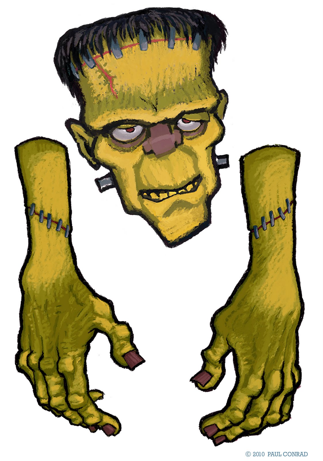
Starting out, I made his head (posted
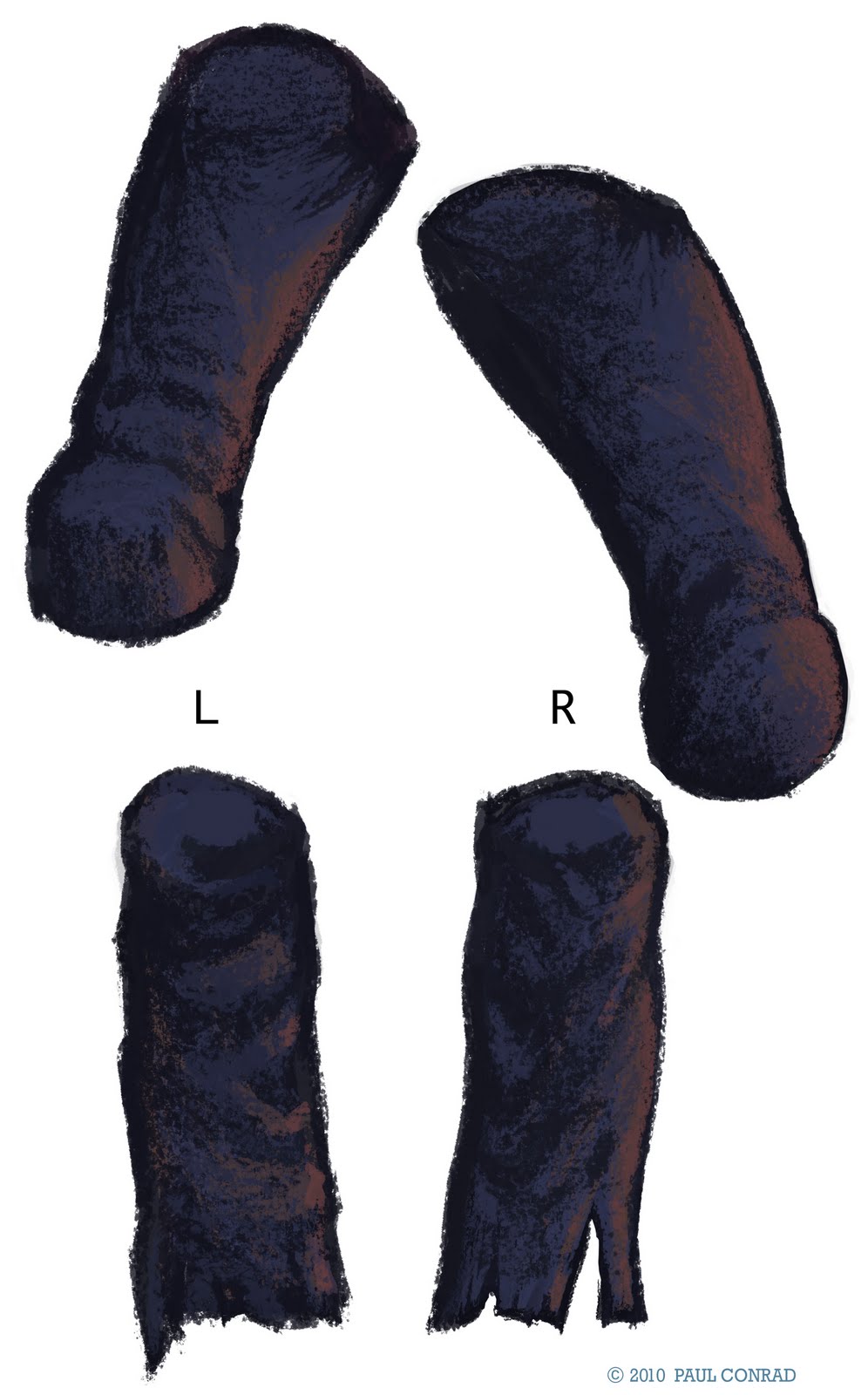
previously), and followed with his various body parts, (a lot like Dr. Frankenstein when you think of it...) Because of the size limitations of my printer, I had to divide some pieces that would ordinarily be "one": The forearms/wrists and hands, or lower leg, ankle and boots for example. After I created the pieces in Photoshop, I printed them all out:


Then, using an exacto, I cut along the edge of the thick black outlines that I put around all his parts. After I cut everything out, I took a black marker and ran it along the exposed white/cut edges...just to help it all blend a little better when assembled.

Next, I inserted black metallic "brads" for the posable joints (I bought mine at Wal-Mart in the craft section, but I bet you could get them at Michaels or Hobby Lobby too):
Upper & Lower Arms
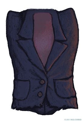
Main Body

Upper & Lower Legs
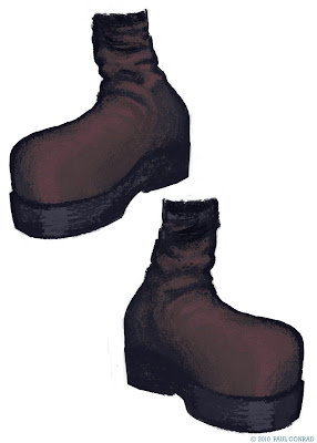
Boots